A lot of water industry technical reports, papers and presentations feature great data presented poorly. This can confuse rather than inform, creating a negative perception in the audience. So, take a look at our tips on how to avoid common mistakes when presenting water data.
Tip 1 - Graph style formatting
Ask yourself which of these two Excel graphs looks more professional for a report or paper? Hint: if you think it’s the one on the left you should probably stop reading!
The emphasis should be on the data. Remove all unnecessary details. Colours aren’t necessary unless they are highlighting differences.
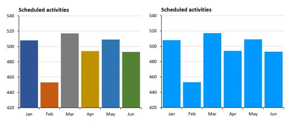
Tip 2 - Use of colour
The over-use of colours is demonstrated further in this next example. In this bar graph the different colours add no value and actually make it harder to interpret the graph, since the colours infer meaning. Whereas a single colour helps the reader compare the differences. Black can be a little oppressive for this style of graph so use a lighter colour.
When displaying more than one variable on a graph a range of different colours are needed. Its important to select a good colour palette. This needs to have a range of distinct colours making sure no one colour is more dominant.
Using different shades of one colour has become quite common lately, as shown in this next example. It can be hard to identify which variable is which on these graphs. Viewing the same graph with a good colour palette is much easier.
Using different shades of one colour has become quite common lately, as shown in this next example. It can be hard to identify which variable is which on these graphs. Viewing the same graph with a good colour palette is much easier.
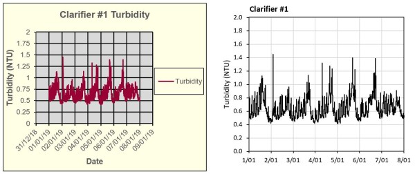
Tip 3 - Graph Scaling
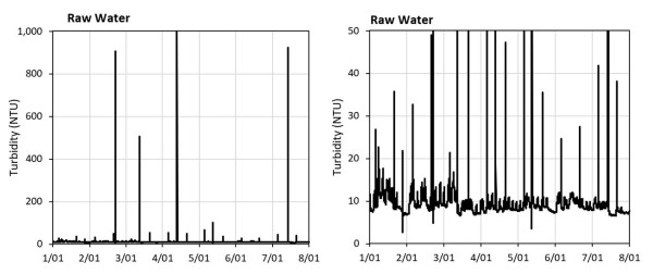
How many times have you seen poorly scaled graphs that obfuscate the data? Here are a few examples of poorly scaled graphs with potential alternatives. In this first example the graph has been set to the instrument scale. The spikes up to 1,000 NTU aren’t adding any value. A simple re-scale shows the data, without losing any important detail.
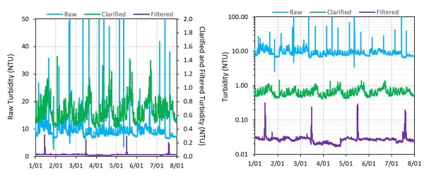
This next example shows three variables on one graph. Using a second Y-axis helps with the scaling but the detail of the filtered turbidity variable is not seen. Using a logarithmic scale shows all three variables clearly.
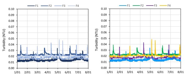
This final example has four variables on one graph and its hard to set a scale or scales to cover all four variables. One option is to use the logarithmic scale again. An alternative is to break this down in to four small graphs.
Tip 4 – Graph type selection
Data in water and wastewater treatment is usually in a time series format and the default go-to graph type is an XY plot with time on the X axis (note line graphs can be used but only if there are regular time intervals). This is an effective graph type for showing events but it’s not great for summarising performance for the time period, particularly if we want to display more then one process variable on the graph.
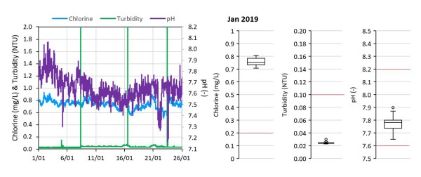
This next example is an XY graph of treatment plant performance. It shows treated water turbidity, chlorine residual and pH for the month of January. The readers eyes and brain have to do a lot of work to evaluate performance for each variable with this graph type.
An alternative is to use box plots. These provide a visual statistical summary of performance for a variable and allow the addition of low and/or high limits. It’s much quicker for the reader to assimilate the data in this format. This style of graph is particularly good if you are reporting on the performance of multiple plants.
Tip 5 - Adding context to a graph
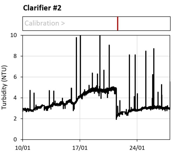
Context is everything when presenting data. Adding contextual information to a graph assists the reader in interpreting cause and effect. Using an event ticker tape, which is a bar chart, is a professional way of doing this. In this example the event ticker shows an instrument calibration is the cause of a step change in the variable.
Tip 6 – Be honest with the data
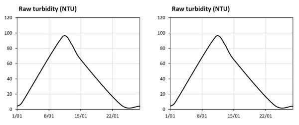
Take a look at this next example of an XY graph showing a raw water turbidity event. The left-hand version is presented as if there was a steady increase in turbidity to a peak at around 95 NTU. In reality the data does not support this conclusion. The data points are shown in the right-hand graph. This shows the event peak may have been 95 NTU or it may have been much higher. There may have been a steady increase in turbidity, or it may have suddenly spiked.
The key point here is that when the data has gaps it’s important to illustrate any interpolation. Using dashed lines with data markers is the easiest way to do this.
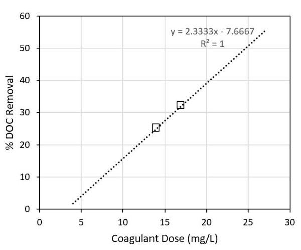
Adding trendlines to limited datasets can also suggest relationships that might not be accurate. This is a real-world example where a statistical relationship was drawn from two data points and presented as fact. When relationships are presented, they need to be based on sound statistical principles.
7 – Avoid the bling
Many authors want to create a visual impact for their audience and sometime let their inner graphic designer run wild. Using 3D graphs made in Excel is a prime example of this. 3D graphs in Excel would feature heavily in a list of the worst graphs ever made. Don’t use them. If you want to use 3D graphs invest in a scientific graphing package. Remember, the aim of data visualisation is to communicate information clearly, accurately and succinctly, and to do this with the least amount of effort required by the viewer.